|
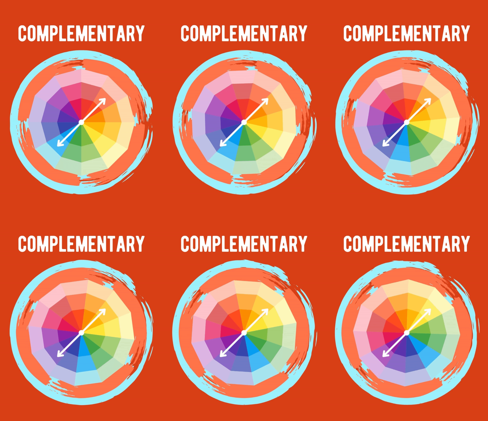
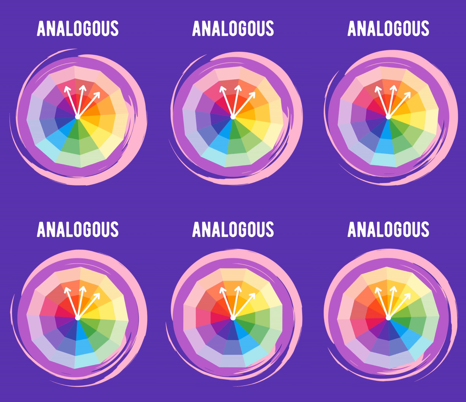
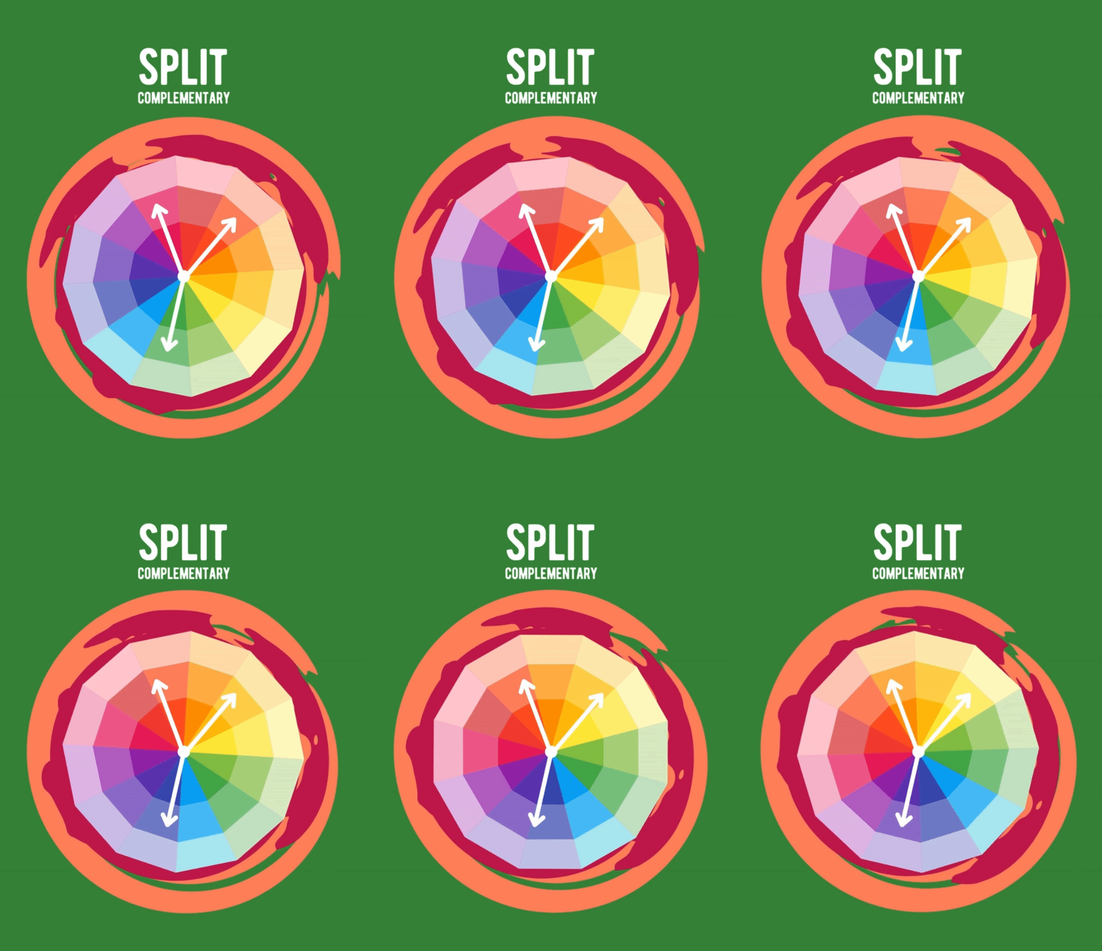
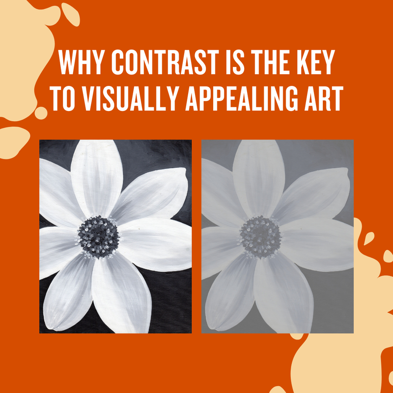
Picture this: you've just finished a gorgeous sketch for a brand-new painting or decided on a design for your latest crochet blanket, but you need to figure out a color scheme, and you're unsure how to choose one that looks good. Don't worry; we've got you covered with our three favorite color patterns for creating a cohesive color palette! Before we get into it fully, you may want to check out our blog post on Why Contrast Is The Key To Visually Appealing Art. Without an understanding of contrast, your pieces may appear flat and dull, even with a gorgeous color palette!
This pattern will provide you with a great chance to play around with color theory and learn to understand how colors interact with each other, making it invaluable to beginner and seasoned artists alike! DO YOU WANT TO UNDERSTAND COLOR THEORY EVEN MORE IN DEPTH?
If you'd like even more color palette inspo, check out our Unique Color Palettes For Art board on Pinterest! As a great exercise, you can identify which color palettes on the board fall into the pattern categories we taught you about and which patterns they are! We hope you learned a lot about color theory in this post, and we would love to see how you use these color patterns. Tag us on Instagram at @thesketchingpad for a chance to be featured! DID YOU LOVE THIS POST? CHECK THESE OUT TOO!
0 Comments
Leave a Reply. |
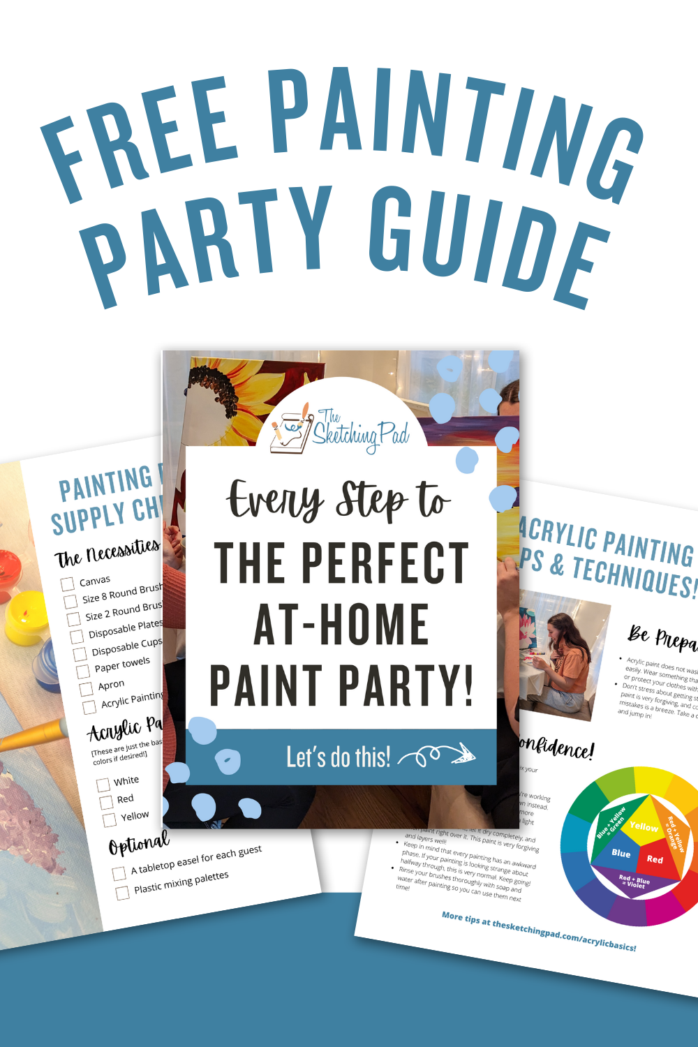
hey there!The Sketching Pad has been helping people just like you have fun and stress-free painting experiences for over a decade. Whether we're helping people create masterpieces in person in our studio, or we're guiding people who are painting at home through our painting kits and video tutorials, we are passionate about helping people see that everyone can be an artist with the right tools and guidance! This FREE Acrylic Painting Guide includes:
You'll learn...
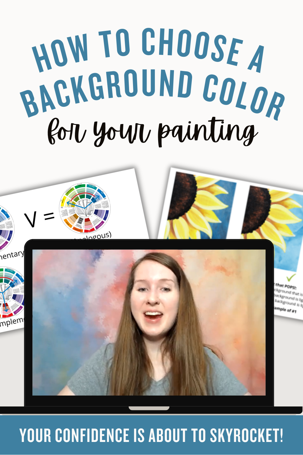
This FREE course includes...
You'll learn...
Archives
June 2024
Categories
All
|




 RSS Feed