The Sketching Pad
  • Art Programs
    • Drop In Hours
    • Private Parties
    • Weekly Classes >
      • Adult Classes
      • Kids' Classes
      • One-on-one Lessons
    • Clay Dates
    • Special Events
    • Field Trips >
      • Field Trips at The Sketching Pad
      • In-House Field Trip Kits
      • In-House Art Field Trips with Our Instructors!
    • Spirit Night >
      • Spirit Nights at The Sketching Pad
      • Spirit Nights at Your School!
    • Camps
  • Art Kits
    • Canvas Painting Kits >
      • Animals
      • Nature
      • Characters
      • Kid Favorites
      • Girls Night
      • Guys' Favorites
      • Valentine's Day
      • Mother's Day
      • Easter
      • Spring
      • Summer
      • Fall
      • Holiday
      • Sorority-Themed
    • Mosaic Kits
    • Pottery Painting Kits
    • Art Lessons at Home
    • Video Painting Tutorials
  • Hire an Artist!
    • Seasonal Window Painting >
      • Seasonal Window Painting >
        • Christmas Window Painting
      • Seasonal Window Stickers
    • Murals
    • Drawings & Paintings

WHY CONTRAST IS THE KEY TO VISUALLY APPEALING ART

9/16/2023

2 Comments


UNDERSTANDING CONTRAST

If you're new to art, you may wonder what contrast is, but to understand contrast, you first need to understand value! The value of a color is determined by how dark or light it is. In the example next to this text, you can easily see the different values of black, going from black to dark gray to light gray, then to white! Understanding value first is essential to understanding contrast, as contrast is the difference between the lightest and darkest values in a piece of art, whether it's a painting, embroidery, etc. Contrast is all about how the different values relate to each other to make up a clear image. Without contrast in a piece, things can look washed out or unreadable. That's why contrast is so important when you're creating art. There are cases when low contrast can be ideal for specific paintings, too, and we'll get into that at the end of this article. The key is to make your contrast decisions intentionally and not accidentally, and we'll show you how!
what are values

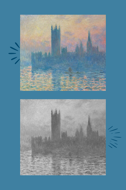
EXAMPLES OF CONTRAST IN A BLACK AND WHITE PAINTING

The example below shows the difference between high contrast and low contrast in a simple black-and-white painting. Below is an excellent example of why high contrast is important in making things clear and readable. On the high contrast side everything is highlighted where it should be and everything that is meant to be bold stands out as it should! That isn't the case on our low contrast side; it's tough to see what it is. Of course, you can still tell that it's a flower, but you might have to look closely to distinguish the details. Art needs to be clear, especially if it's something like this where it's an object; it's even more critical in a portrait where it needs to look like someone specific.
contrast in art

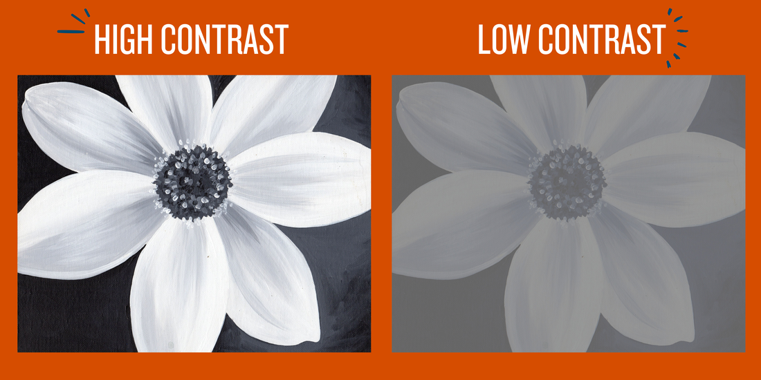
EXAMPLES OF CONTRAST IN A FULL COLOR PAINTING

​In the following example, you can see high contrast versus low contrast in a full-color painting. Just like the first example, you can see just how much easier it is to tell what you're looking at in the high contrast painting; even though the color makes it a little more apparent where different objects are in the image, it's still nowhere near as pleasing to look at as the high contrast example. ​
contrast meaning
​

painting kit diy
​

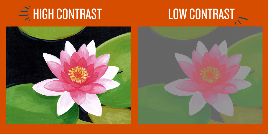
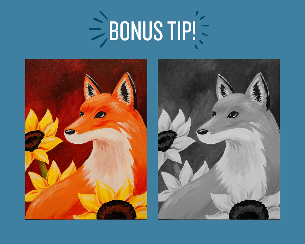
HOW TO MAKE SURE YOUR ART HAS ENOUGH CONTRAST

It's easy to tell if your art has enough contrast if it's already in black and white, but what if it's in color? How on earth are you supposed to be able to tell what your color values are? It's easier than you might think! Just take a photo of your painting and edit the saturation down to zero; this will give you an exact look at the values so you know if you'll need to make any adjustments! Not that technical? Try this: when looking at your painting, identify the lightest and darkest areas. If you need help determining what those are or if the lightest and darkest areas are at all similar to each other, bump up the contrast! You can mix white with colors to lighten certain areas and darken others by mixing in black. This method can be especially helpful if you're working from a reference because you can go ahead and adjust the saturation of your reference photo too, to see if they match up! ​

WHEN IS LOW CONTRAST IDEAL?

Using light to medium values and low contrast can be beneficial when you're going for a soft, calm, or subtle feel for a painting! Similarly, when going for a moody or harsh feeling for your art, going with medium to dark values in low contrast will bring those feelings. The example next to this text is by Claude Monet shows in this light, low contrast painting that you can still not only offer a lot of definition but also create stunning works of art. The key to using low contrast in your art is that everything must still be readable. In this Monet example, even when I turn the saturation of the painting down, you can still tell you're looking at a building with water and a cloudy sky. The color helps to bring it all together, but what you're looking at is still very clear! Context and the feeling in a painting are things you should think about before using low contrast in your work. Still, in the cases it is used purposely to show certain feelings, it can be absolutely stunning!
claude monet
The Houses of Parliament, Sunset, Claude Monet
how to use acrylic paint

​READY FOR MORE VALUABLE PAINTING TIPS?

​Take your art to the next level with this free guide on choosing a background color using color theory!
i'M READY TO LEARN MORE!

Foundations 1: Value, Art Lesson Pack

$99.99 $74.99
Shop

Foundations 2: Color Theory, Art Lesson Pack

$99.99 $74.99
Shop

TAKE YOUR SKILLS TO THE NEXT LEVEL WITH OUR DETAILED, AT-HOME PAINTING COURSES!

Want to take this further? These courses will take the mystery out of creating artwork and will give you confidence moving forward. Not only will you create beautiful drawings and paintings, but you'll know WHY and HOW you did it, so you'll be able to do it again and again.
color theory, color theory for beginners, easy color theory
THE EASIEST COLOR THEORY CONCEPT TO USE ON YOUR CANVAS PAINTINGS!
​READ MORE
painting mistakes, acrylic painting,
HOW TO FIX YOUR ACRYLIC PAINTING MISTAKES!
READ MORE
painting, acrylic painting, painting backgrounds, background
3 TIPS TO CREATING THE PERFECT PAINTING BACKGROUND!
READ MORE
2 Comments
bronzedbyjulie link
9/20/2023 02:33:43 am

I think my blog also got a kinda cool comment form. A very nice.

Reply
brooklynbeautylounge link
9/20/2023 10:51:37 pm

Thanks for sharing good and amazing blog.

Reply


Leave a Reply.

    Picture

    hey there!

    The Sketching Pad has been helping people just like you have fun and stress-free painting experiences for over a decade. Whether we're helping people create masterpieces in person in our studio, or we're guiding people who are painting at home through our painting kits and video tutorials, we are passionate about helping people see that everyone can be an artist with the right tools and guidance!

    Picture
    This FREE Acrylic Painting Guide includes:
    • How to prepare for painting.
    • Things to keep in mind as you paint.
    • How to confidently mix colors.
    • Stippling
    • Blending
    • Splattering
    • And so much more!
    sign up for free!

    Picture
    You'll learn...
    • How to prepare your home
    • How much time to allow for painting
    • A printable supply checklist
    • A detailed explanation of the art supplies you'll be using
    • A printable painting guide to give your guests
    • Easy, big-batch drink recipes
    • Ideas for decorations
    • And more!​
    sign up for free!

    Picture
    This FREE course includes...
    • ​What to determine before you even think about your background
    • How to pick a gorgeous color palette that is backed by science
    • Why choosing a background color isn't enough, and one last decision you should make
    Sign up for free!

    Picture
    You'll learn...
    • What tiles to buy
    • What grout to use
    • Exactly what supplies you'll need
    • How to prepare for your project
    • How to complete every step of the project
    • How to grout to perfection
    • How to tint grout
    • How to seal your project for the weather
    • ​And more!
    Sign up for free!

    Archives

    July 2024
    June 2024
    May 2024
    March 2024
    February 2024
    January 2024
    November 2023
    October 2023
    September 2023
    August 2023
    July 2023
    June 2023
    May 2023

    Categories

    All
    Mosaic-tips-techniques
    Painting-party-guides
    Painting Tips & Techniques

    RSS Feed

STAFF        MISSION & VISION        HISTORY        BLOG        CONTACT        678-787-2552        924 Center Street, Olde Town Conyers
Proudly powered by Weebly
  • Art Programs
    • Drop In Hours
    • Private Parties
    • Weekly Classes >
      • Adult Classes
      • Kids' Classes
      • One-on-one Lessons
    • Clay Dates
    • Special Events
    • Field Trips >
      • Field Trips at The Sketching Pad
      • In-House Field Trip Kits
      • In-House Art Field Trips with Our Instructors!
    • Spirit Night >
      • Spirit Nights at The Sketching Pad
      • Spirit Nights at Your School!
    • Camps
  • Art Kits
    • Canvas Painting Kits >
      • Animals
      • Nature
      • Characters
      • Kid Favorites
      • Girls Night
      • Guys' Favorites
      • Valentine's Day
      • Mother's Day
      • Easter
      • Spring
      • Summer
      • Fall
      • Holiday
      • Sorority-Themed
    • Mosaic Kits
    • Pottery Painting Kits
    • Art Lessons at Home
    • Video Painting Tutorials
  • Hire an Artist!
    • Seasonal Window Painting >
      • Seasonal Window Painting >
        • Christmas Window Painting
      • Seasonal Window Stickers
    • Murals
    • Drawings & Paintings